


The Haatz CI is the face of the brand, conveying trust and premium value to customers.


Color System
The color system is one of the core elements of the C.I.S (Corporate Identification Standards) and forms Haatz’s unique color identity. It is divided into a main color and sub-colors, among which Blue (Pantone 299 C) serves as the main color and represents Haatz.
Main Color
Sub Color
Signature Type
Because the Haatz logo uses officially designated colors to maintain consistent corporate identity, it may not be altered or reproduced in any other colors. The standard color expression for the Haatz watermark uses Blue and Gray on a gray background, though single-color expressions in Dark Gray or Black may be used depending on the situation.
-
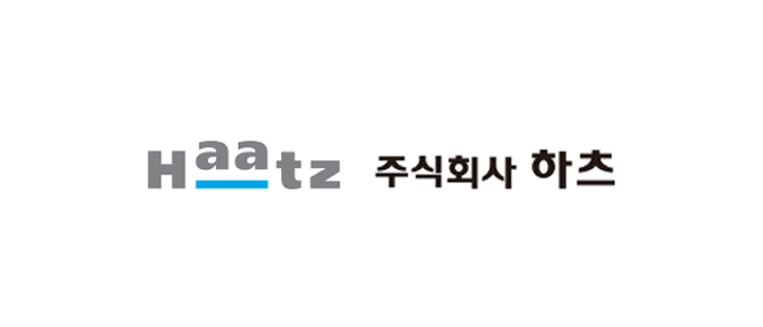
Horizontal Type A
-
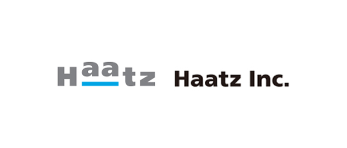
Horizontal Type B

-
Horizontal Type C
-
Vertical Type A

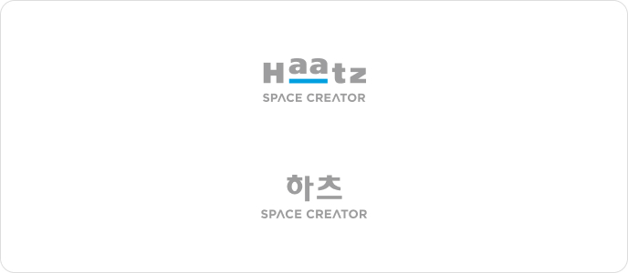
Slogan Type
The slogan “Space Creator Haatz” reflects our philosophy of being more than just a kitchen appliance brand—it represents a brand that designs life through space. Grounded in technology, design, and a deep understanding of people, Haatz transforms every space we inhabit into a more comfortable and sensory-enriched experience.
-
Korean Horizontal Type

-
Korean Vertical Type

-
English Horizontal Type

-
English Vertical Type
 User
User